I have been looking for ways to visualize what happens to a trading system when we shift it’s parameters. I bumped into this little free tool that might help us do that. Let’s start from the beginning:
We will start with a hypothetical mean reversion system and check visually what happens as the parameters change.
We will run the backtests using the SPY etf (NYSEARCA: SPY) as a proxy for the S&P500.
Rules:
1. We can only buy when the close is above it’s 200 day moving average.
2. We buy when the RSI falls below 30.
3. We sell when the RSI rises above 55.
The easy case: Two parameters
We want to try different parameters. Instead of a 200-day filter we will try all moving averages periods between 10-days and 300-days, in 10 day increments.
For the RSI period we will try periods ranging from 2-days to 14-days.
So after optimizing the parameters we end up with a table listing the possible combinations of parameters and the profit they produce. In this case we are not using profit as a performance metric but Average Annual Return /Maximum drawdown (CAR/MDD).
Since we have 2 parameters we can visualize them. The higher the “mountain” (car/mdd) the better.
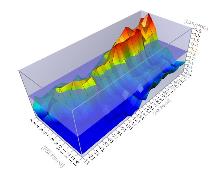
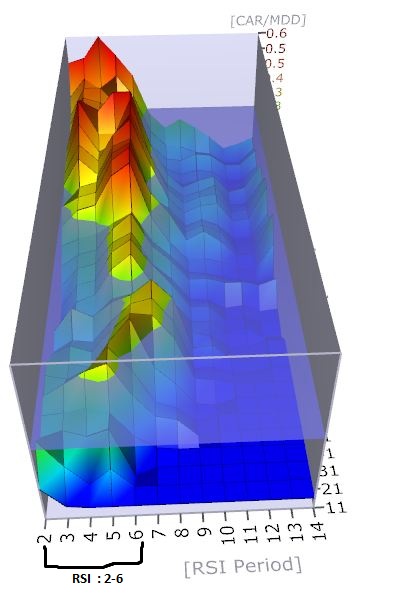
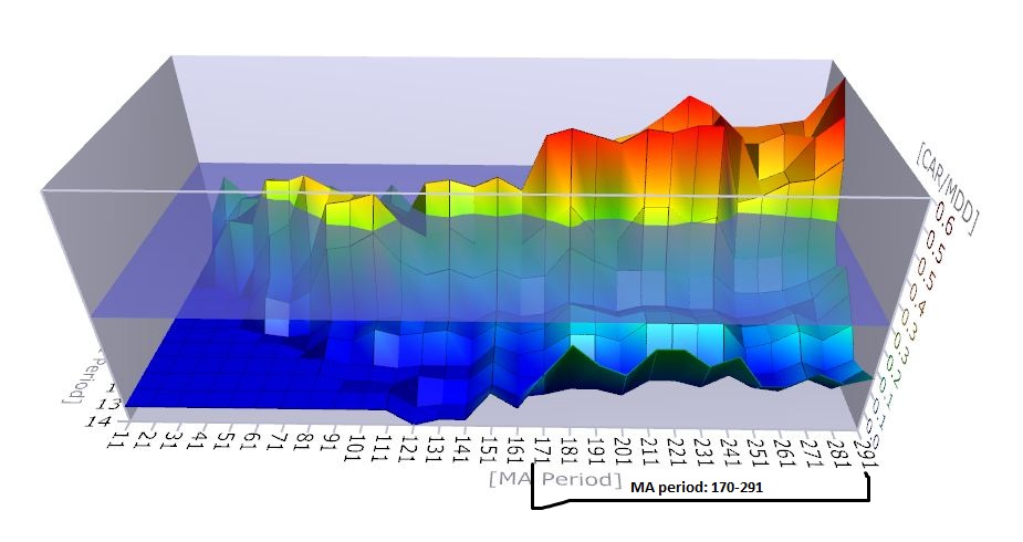
By visual inspection we can see that there is a fairly smooth area between 170-290 for the moving average and 2-6 for the RSI. Any choice of parameters inside those ranges would produce fair risk adjusted return.
What about 4 parameters?
Now we want to try out different thresholds for the RSI indicator. We have tried 30 as a “buy” threshold and 55 as the “sell” one. We ‘ll optimize those values as well. Now we have 4 parameters. How do we visualize them?
After optimization, we should have a table that lists the different combinations of parameters and the corresponding statistics. We ‘ll export it into a csv file*.
Now we ‘ll get this free app called XDat. It reads csv files (with headers) and produces these weird looking graphs, called Parallel Coordinates.
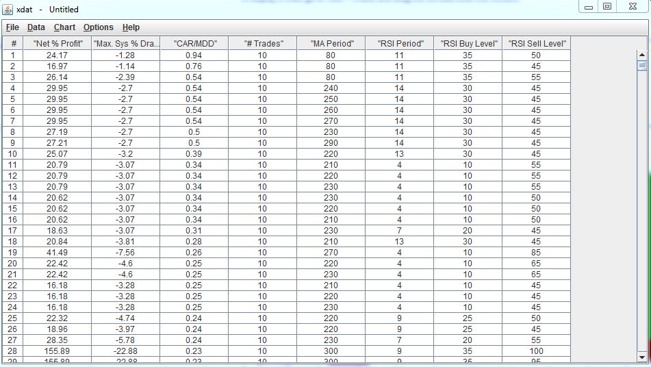
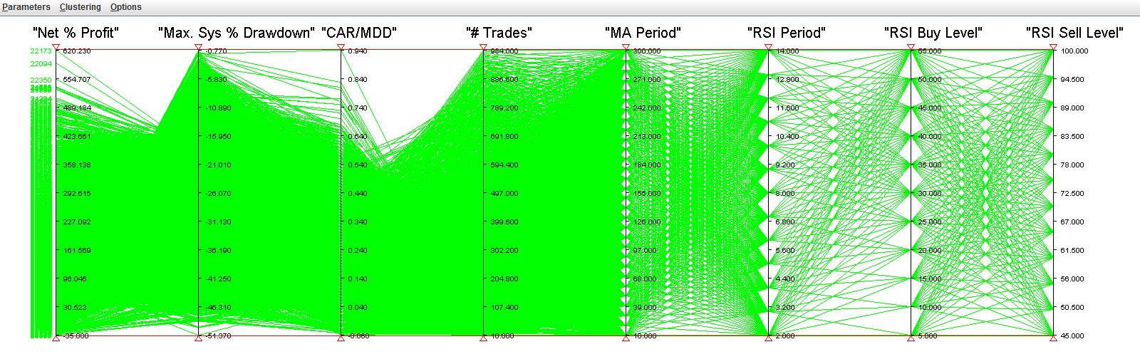
Each column can be tweaked. Let’s say we wanted to see the most profitable parameters. We would go to the first column (Net % Profit) and raise the little red triangle all the way up:
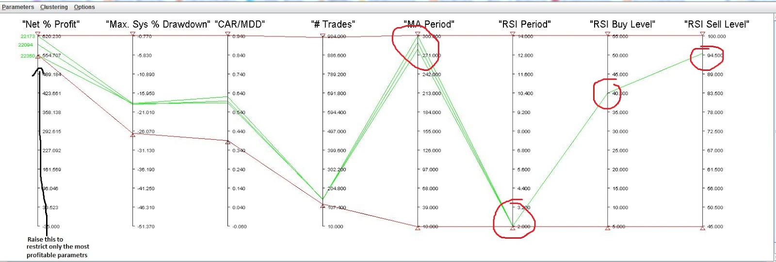
We see that the most profitable systems correspond to parameters: MA period around 300, rsi period 2, Buy level at 40 and sell level at 95. This is what we would get if we just did the optimization and looked at the sorted results. These would be the “best” parameters.
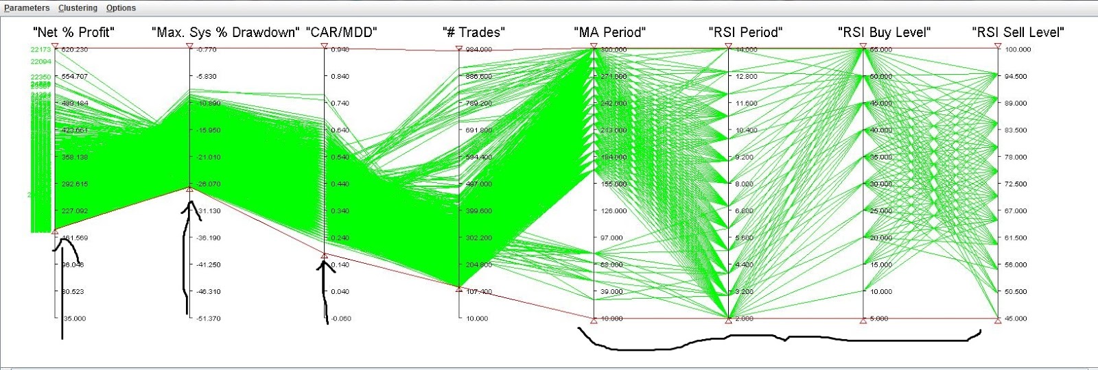
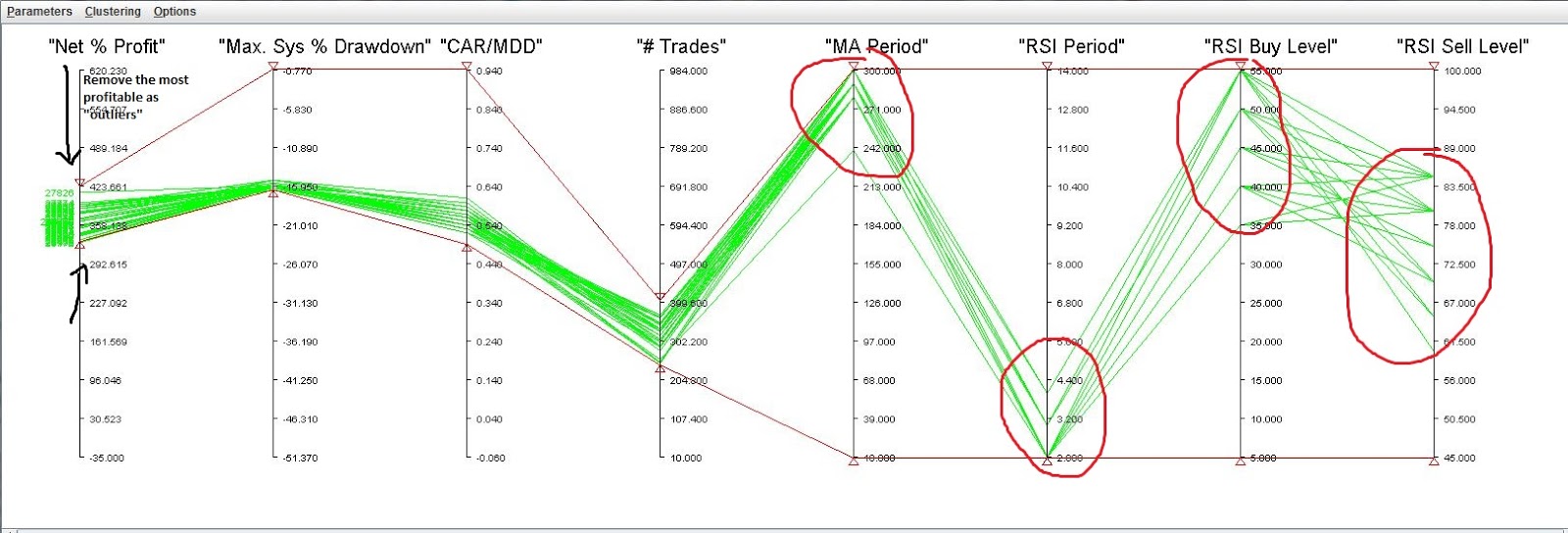
Now going back and lowering the triangle, we see that the most profitable systems correspong to just a few trials. Most of the trials are below that. So we should consider these “best” parameters as “outliers” and throw them out. We do that by lowering the top red triangle and cutting the top off.
Playing around a bit more we come up with this:
The upside to this procedure is that it’s easy and understandable for a few parameters.Maybe the next step in visualizing further parameters would be to use Self-Organizing-Maps. Anyone who has experience using SOM’s is welcome to comment. Other ideas are welcome.
____________________________________________________________________________
* I used Amibroker to optimize the parameters. Amibroker produces a table that includes many statistics as columns for each set of parameters: Profit, profit factor, k-ratio, % winning trades, etc. After exporting this table to csv, I manually deleted most of the columns (i.e., profit factor, etc…) as well as some rows (i.e. parameters that resulted in less than 10 trades). This was done to decrease the size of the csv.
Very good post. im using only 3d optimization charts. What about determining which factor has significant impact on fitness function. Anova?
Thanks.I am not familiar with analysis of variance. I am looking into it.